
This lesson explains how to describe a line graph or bar chart for IELTS task 1 that is over time. This uses an example of a bar chart, but it will be the same for a line graph.
Types of Language Needed
When you get a chart or graph to describe, it is always important to check whether there is a time frame or not. If there is, you will need to use the language of change (e.g. increased; decreased).
However, it is not enough just to describe the changes of each element (ActiveX, Java and Net in this case) on their own and ignore how they relate to each other.
Look at the question. It says:
- Summarise the information by selecting and reporting the main features and make comparisons where relevant.
You are asked to compare the data as well. So you must also compare the elements where relevant in your IELTS task 1 (e.g most popular; lower; the least).
Organisation
You must also group data together to make sure you have a well organized and coherent answer. To do this, you need to look for similarities and differences when you first analyze the graph for IELTS task 1, and decide what can be logically put together or not.
Sample Graph and Answer
Now look at the bar chart below and read the IELTS task 1 model answer.
You should spend about 20 minutes on this task.
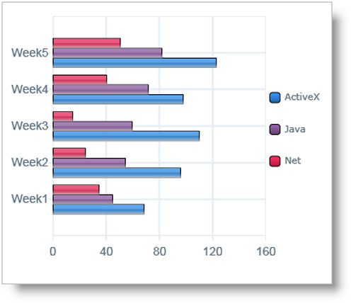
The bar chart shows the number of times per week (in 1000s), over five weeks, that three computer packages were downloaded from the internet.
Summarise the information by selecting and reporting the main features and make comparisons where relevant.
Write at least 150 words.
IELTS Task 1: Describing a Graph Over Time
Model Answer
The bar chart illustrates the download rate per week of ActiveX, Java and Net computer packages over a period of five weeks. It can clearly be seen that ActiveX was the most popular computer package to download, whilst Net was the least popular of the three.
To begin, downloads of ActiveX and Java showed similar patterns, with both gradually increasing from week 1 to week 5. However, the purchases of Active X remained significantly higher than that of the other product over this time frame. In week 1, purchases of ActiveX stood at around 75,000, while those of Java were about 30,000 lower. With the exception of a slight fall in week 4, downloading of ActiveX kept increasing until it reached a peak in the final week of just over 120,000. Java downloads also increased at a steady rate, finishing the period at 80,000.
The product that was downloaded the least was Net. This began at slightly under 40,000, and, in contrast to the other two products, fell over the next two weeks to reach a low of approximately 25,000. It then increased sharply over the following two weeks to finish at about 50,000, which was well below that of ActiveX.
(Words 198)